Knowledge base
Letter Visibility and Readability Guide
Practical guidance for choosing letter sizes that can be read at real-world viewing distances.
Letter visibility depends on distance, speed, contrast, lighting, viewing angle, and how much time a person has to process the message. Use this guide as a starting point, then increase letter size when conditions are less than ideal.
Planning basics
How to Use This Guide
Start with the maximum expected viewing distance, then adjust for the conditions in which the sign will actually be seen.
Start With Distance
The farther away the viewer is, the taller the letters need to be. If the sign must be read from multiple distances, size the primary message for the longest critical viewing distance.
Adjust for Real Conditions
Increase letter height when the sign has low contrast, glare, shadows, a busy background, an angled view, fast-moving traffic, or a short viewing window.
Use These Numbers as a Baseline
Letter-size requirements vary with typeface, stroke width, spacing, color contrast, traffic speed, lighting, weather, sign placement, and viewing angle. When conditions are difficult, use larger letters and fewer words.
Distance guide
Recommended Letter Height by Viewing Distance
General starting points for common sign applications under favorable viewing conditions.
| Maximum Viewing Distance | Recommended Minimum Letter Height | Typical Application |
|---|---|---|
| 10 to 25 feet | 1 to 2 inches | Reception signs, interior wayfinding, and menu boards |
| 25 to 50 feet | 2 to 4 inches | Retail aisles, small lobby signs, and point-of-purchase graphics |
| 50 to 100 feet | 4 to 8 inches | Parking lots and pedestrian-speed exterior signage |
| 100 to 250 feet | 8 to 18 inches | Primary site identification and building fronts on slower roads |
| 250 to 500 feet | 18 to 36 inches | Arterial roads and higher-speed traffic |
| 500 to 750 feet or more | 36 inches and larger | Highways and long-range identification |
These values assume clear sight lines, good lighting, high contrast, and a straightforward typeface. Actual conditions may require larger lettering.
Readability factors
What Changes the Required Letter Size?
The same letter height can perform very differently depending on the environment.
Lighting
- Glare, shadows, and backlighting reduce readability.
- Uneven lighting may require larger letters and heavier strokes.
- Nighttime visibility depends on illumination and contrast.
Color Contrast
- High contrast improves recognition at a distance.
- Busy backgrounds and gradients slow visual processing.
- Brand colors may need adjustment for signage use.
Typeface and Layout
- Simple typefaces with normal stroke widths read more quickly.
- Script fonts, thin strokes, and tight spacing reduce legibility.
- Short messages are easier to read than long sentences.
Speed and Angle
- Drivers need larger letters than pedestrians.
- Angled views and high mounting positions can reduce readability.
- Less viewing time requires larger letters and fewer words.
Quick reference
Practical Rules of Thumb
Fast starting points for early sign planning.
- For interior wall signs read from 10 to 20 feet, start around 1- to 2-inch letters.
- For parking-lot or building identification read from 75 to 150 feet, plan for approximately 6- to 12-inch letters.
- For street-facing signs along 35- to 45-mph roads, primary copy often requires 18- to 24-inch letters or larger.
- When uncertain, increase the primary letter size and shorten the message.
Examples
Real-World Scenarios
Examples connecting common viewing distances to practical starting sizes.
Storefront on a Sidewalk
Typical distance: 15 to 40 feet
Starting letter height: 2 to 4 inches for primary copy
Appropriate for pedestrian traffic and small urban storefronts.
Street-Facing Building Sign
Typical distance: 100 to 200 feet
Starting letter height: 12 to 24 inches for primary copy
Common for buildings along slower arterial roads or commercial corridors.
Interior Lobby Sign
Typical distance: 8 to 15 feet
Starting letter height: 1 to 2 inches for logos and text
Suitable for reception signs and interior feature walls viewed at close range.
Frequently asked questions
Letter Visibility FAQ
Do I Always Have to Use These Sizes?
No. These are starting points under favorable conditions. High contrast and short messages may perform at smaller sizes, while difficult conditions usually require larger letters.
Does This Apply to Digital Signs?
The same basic principles apply, but digital signs also introduce brightness, motion, changing content, and dwell time. Message length and display duration must be considered together.
Can You Recommend Sizes for My Project?
Yes. Send photos, approximate viewing distance, traffic speed, mounting location, and the proposed message. We can recommend practical starting sizes and production options.
Project guidance
Need Help Selecting Letter Sizes?
Tell us where the sign will be used, how far away viewers will be, and how quickly they will pass it. We will help you select practical letter sizes and materials for the application.
Reference Note
This page provides general planning guidance and is not a substitute for an engineering study, traffic analysis, local sign-code review, or site-specific visibility assessment.
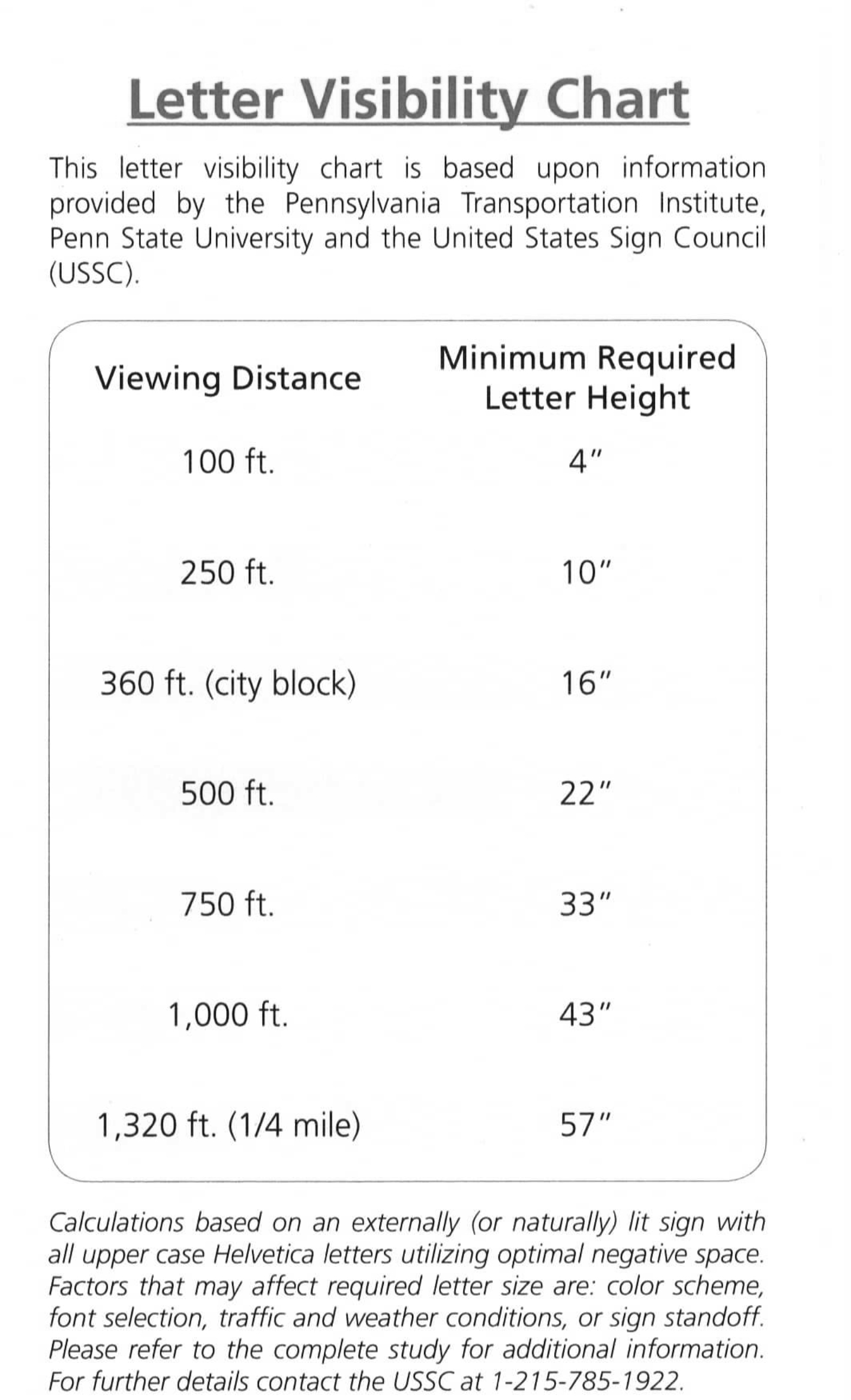
The original reference image cites research and guidance associated with the Pennsylvania Transportation Institute and the United States Sign Council.